Size &
Length
Brand Identity & Integrated Campaign
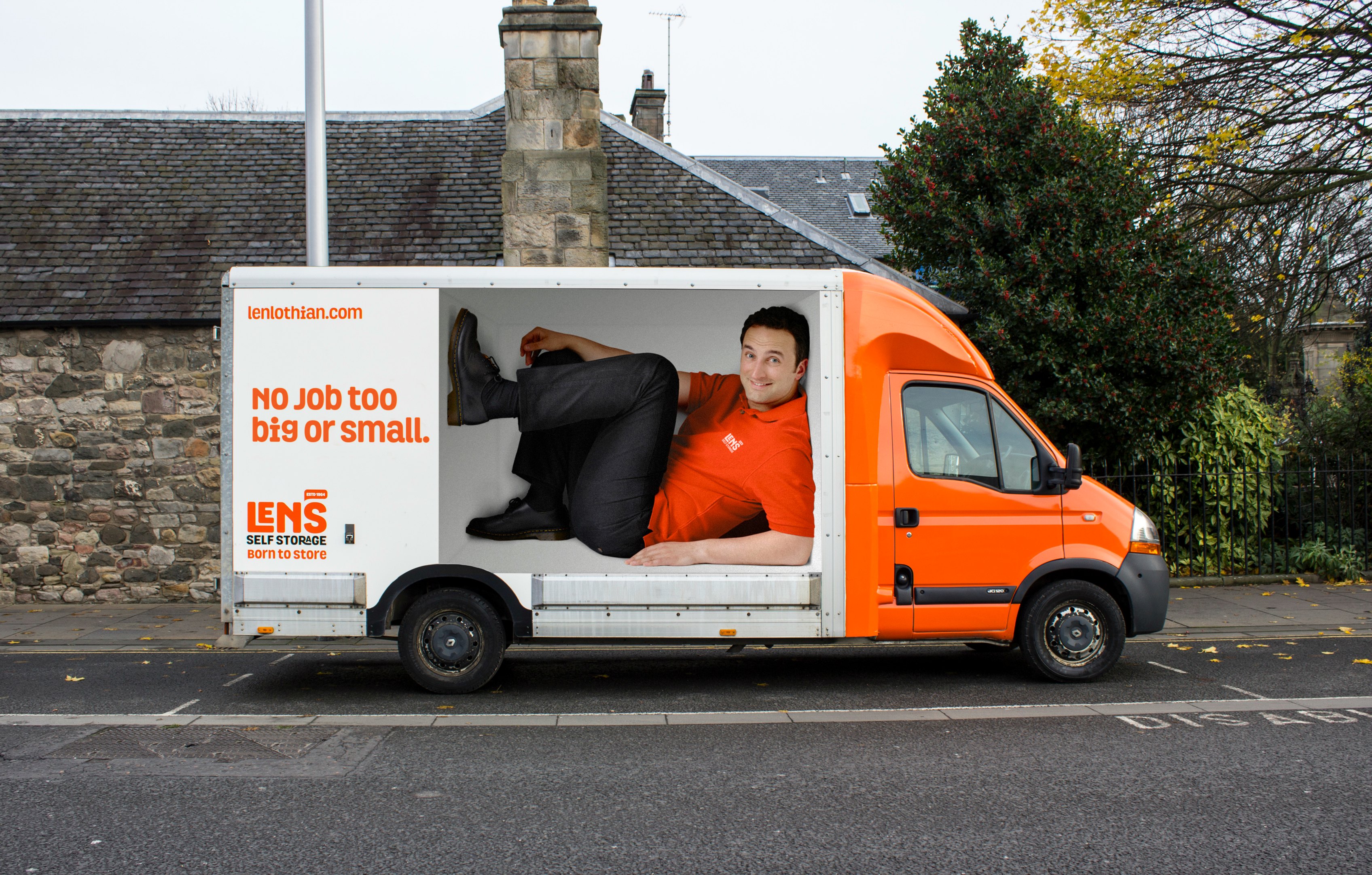
When we were asked to rebrand Len Lothian, we didn’t pick a new typeface and choose a colour. We thought about who they are from the bottom up. A business that’s been in the family for over 50 years means that storage runs in their blood. Our new platform touched everything from their logo to their buildings, uniforms and website, and was underpinned by the line – ‘Len’s Self Storage. Born to store.’
Client | Len's Self Storage
Discipline | Ambient • Brand Design • Design • Online Marketing • Print • Social Media • Web Design & Build
Year | 2014
View work from this campaign:
PARK AMBIENT
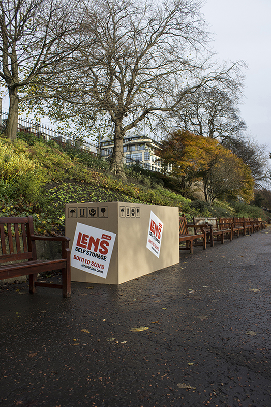
VIEW
View
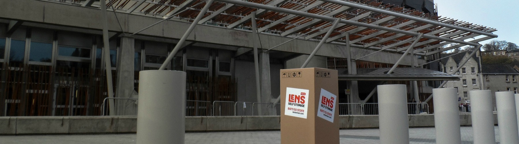
PARLIAMENT AMBIENT
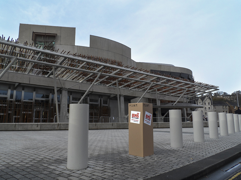
VIEW
View
PHONE BOOTH AMBIENT
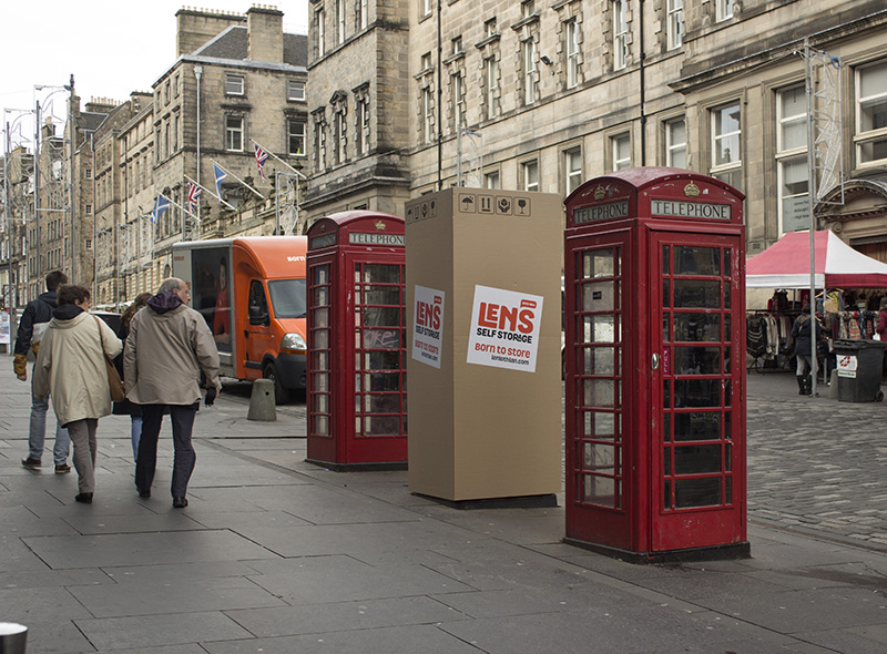
VIEW
View
'ON THE STREET' TV
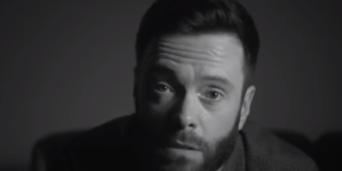
PLAY
Watch Now
BRAND IDENTITY
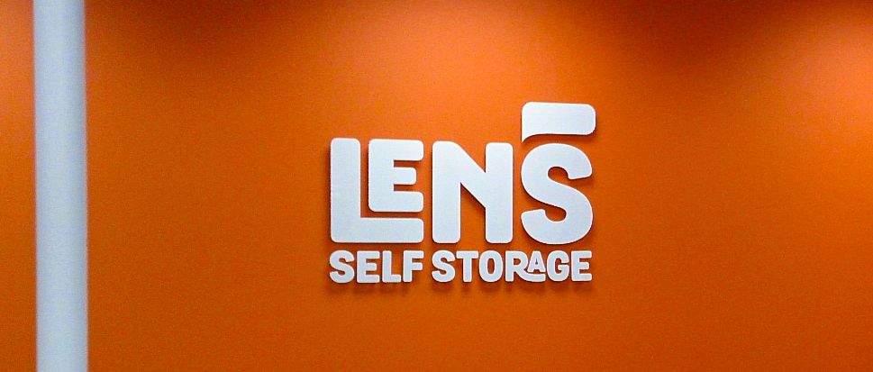
VIEW
View
Website

Visit
View
CRYING VW
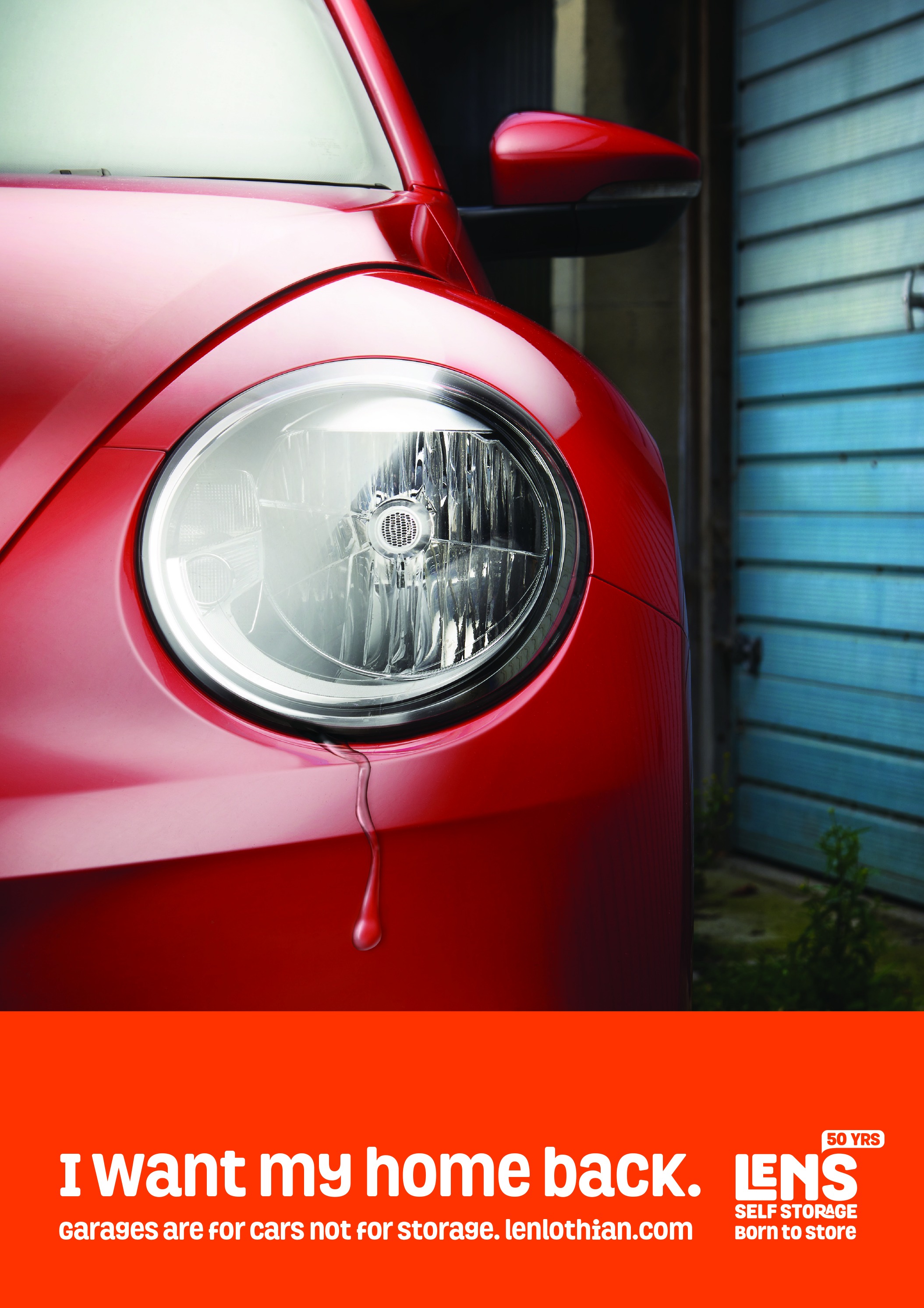
VIEW
View
CRYING FIAT
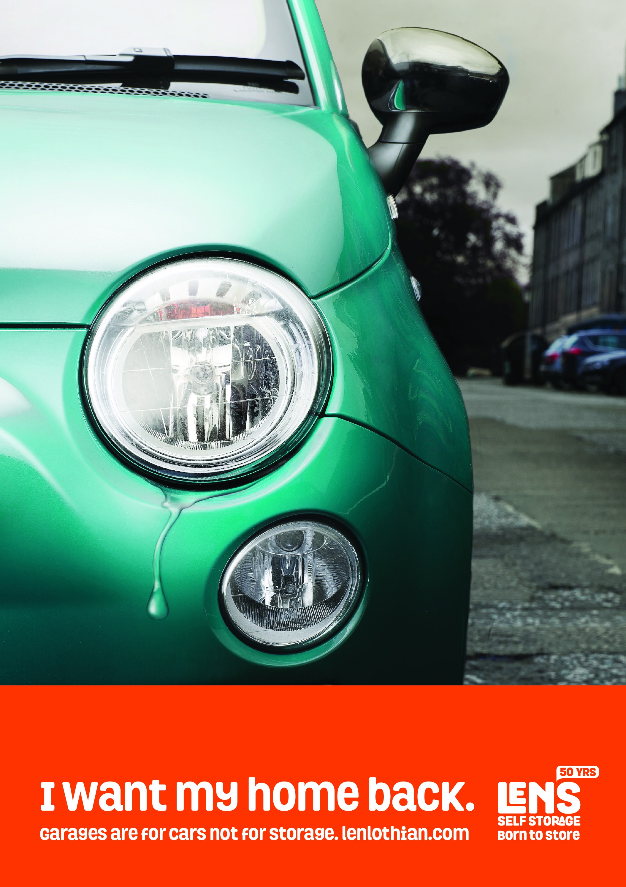
View
MAN WITH A VAN
VIEW
View
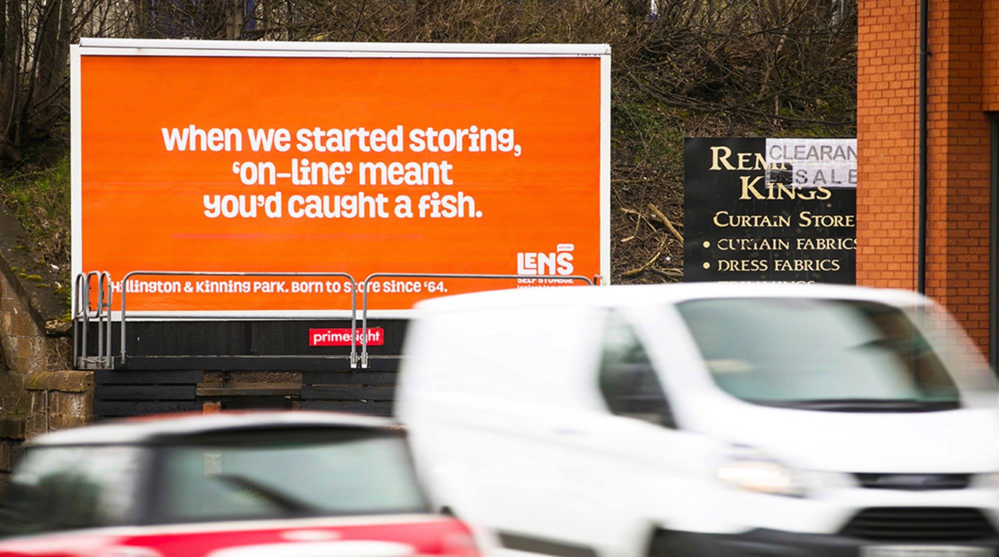
ON-LINE - OUTDOOR
VIEW
View
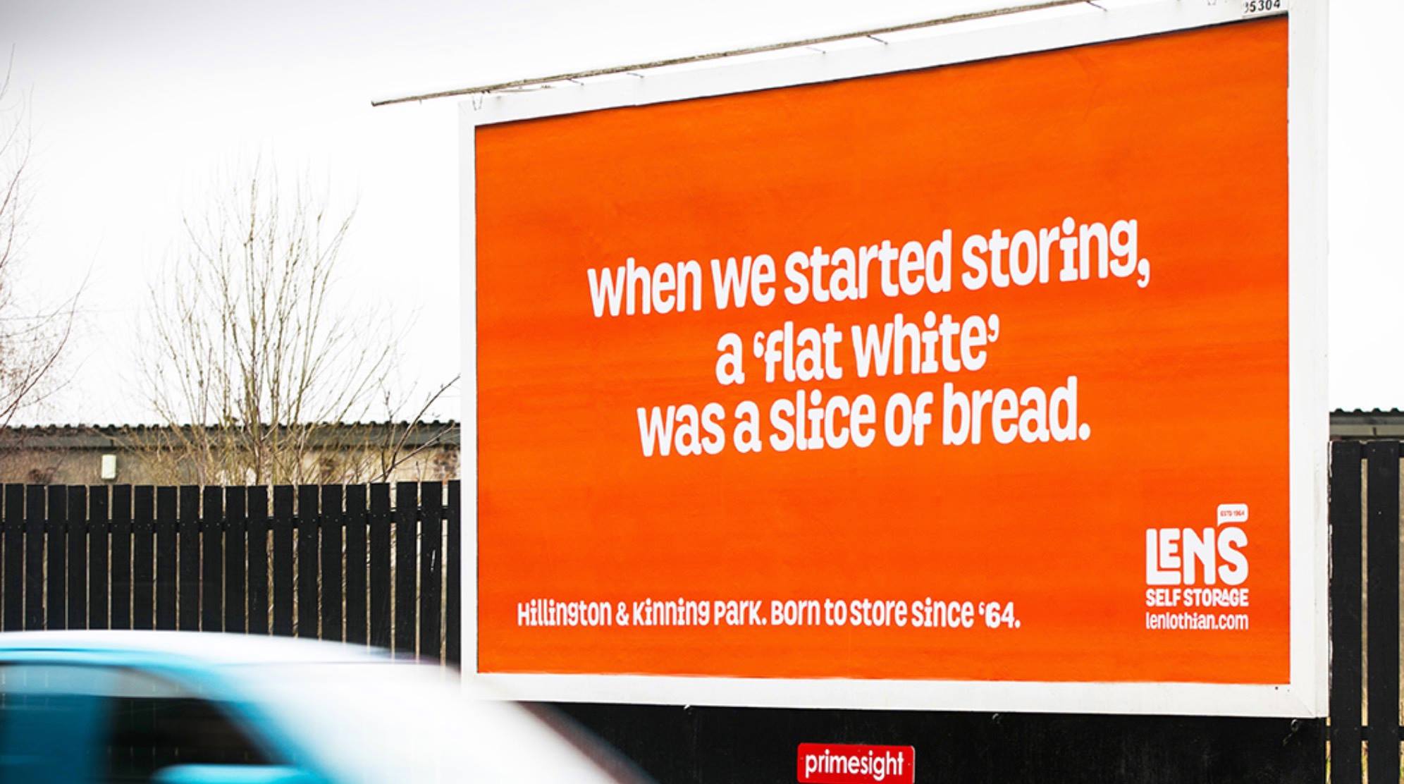
FLAT WHITE - OUTDOOR
VIEW
View
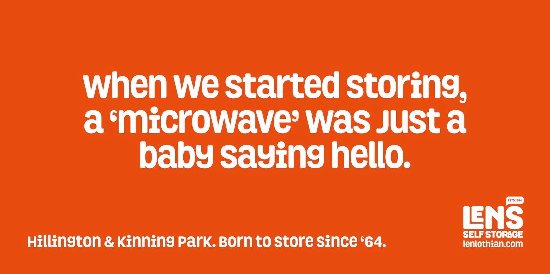
MICROWAVE - OUTDOOR
VIEW
View